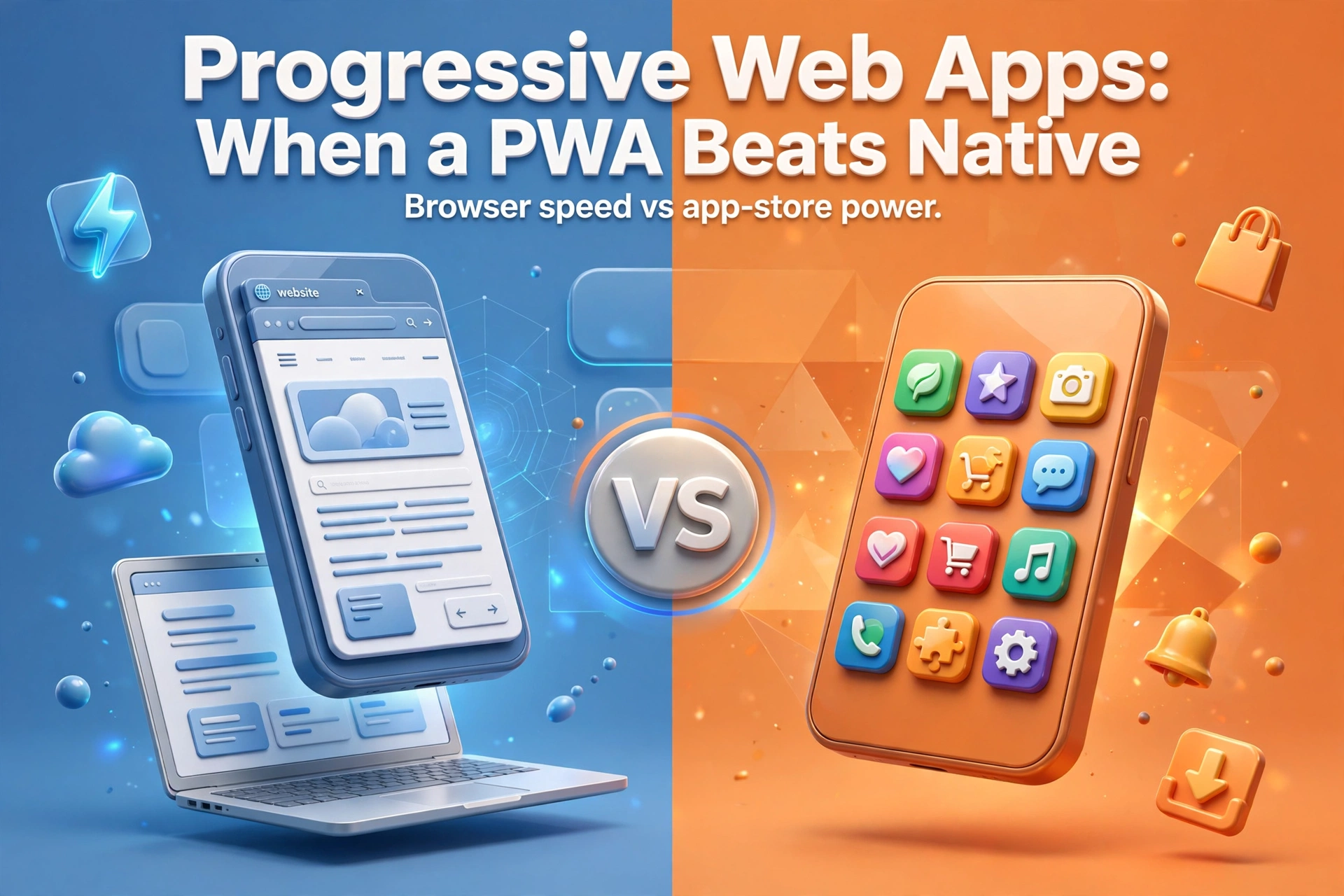
Progressive Web Apps in 2026: When a PWA Beats Native
Progressive web app vs native, compared honestly: cost, offline use, store reach and performance, so you can choose the right build for your product.
 Talha Javed7 min read

Most websites do not fail all at once. They fade: copy drifts out of date, pages get slower, the enquiry form stops matching how customers want to reach you, and because the decline is gradual, nobody calls it a problem until the phone goes quiet. These website redesign signs are rarely about how a site looks; they are about how it performs for the business it serves.
A website redesign is not a fresh coat of paint. Done properly, it rebuilds the structure underneath: what each page is for, what a visitor should do next, how fast it loads, and how easily your team can change it. Here are seven website redesign signs that tell you your business has outgrown its site.
Speed is the first impression your site makes, and it happens before anyone reads a word. A homepage that takes several seconds to appear on a phone tells a visitor, fairly or not, that working with you will be slow too. People do not wait politely. They go back to the search results and open your competitor instead.
The usual culprits are unoptimised images, heavy page builders, scripts piled on over the years, and hosting chosen for price rather than performance. A redesign is the right moment to fix this: compress images and strip out plugins and trackers you no longer need.
Most visitors are on a phone. If your site was designed for desktop and merely squeezed down, the symptoms are easy to spot: text too small to read without pinching, buttons a thumb cannot reach, menus that hide the page they navigate, and forms that demand desktop-style typing.
Test this honestly. Open your site on a real phone and try to do the one thing a customer would do: find a price, book a call, or send an enquiry. If that journey feels like work, you are losing business daily. A modern redesign starts mobile-first: the phone layout is designed first, and the desktop version grows out of it.
A site that only a developer can change is a site that quietly goes stale. Prices change, services evolve, and every small edit becomes a ticket, a wait, and a bill, so the edits do not happen. The homepage still advertises a service you stopped offering two years ago.
This is one of the clearest website redesign signs, because it is about ownership, not aesthetics. A redesign should leave your team able to edit text, swap images, add a page, and publish a post without touching code. Say so in the brief.
Read your homepage as a stranger would. In ten seconds, can they say what you sell, who it is for, and what to do next? Many established businesses fail this test, not because their work is unclear, but because their site grew by accretion: a page for a new service here, a banner for an old offer there, a tagline from when the company did something different, until it reads like three businesses at once.
The fix is not cleverer copy. It is fewer messages, in the right order: who you help, the problem you solve, proof that you solve it, and one clear next step. Everything else, company history, full service list, awards, belongs deeper in the site.
A site can generate traffic and still fail the business. If your inbox fills with requests you cannot serve, wrong budgets, wrong locations, services you do not offer, your site is attracting the wrong audience, or not filtering well enough. Vague copy is usually the cause: a site that claims to do everything for everyone invites everyone, including people you cannot help.
A redesign lets you qualify visitors before they reach out. Clear service pages describing who each service is for, honest indications of scope, and forms asking one or two useful questions will cut the noise dramatically. You will get fewer enquiries, and that is the point: ten from the right buyers beat fifty from people you have to turn away.
Customers compare you, whether you like it or not. When someone shortlists three suppliers, they open three websites side by side. An outdated site does not just look old; it raises a question your competitors do not have to answer: if they cannot keep their own website current, what will working with them be like?
You do not need the flashiest site in your market. You need one that looks like a business operating today: current work, current contact details, and a design that does not date you to a particular era. If opening your competitors’ sites makes you wince, trust that reaction, your prospects are having it too.
This is the sign that covers all the others. Perhaps you have moved upmarket, added a service line, started serving a new country, or shifted from one-off projects to ongoing work. If the site still describes the business you were three years ago, every new visitor meets a company that no longer exists.
A redesign is the moment to realign the site with the business you actually run: which pages earn their place, which services lead, and what the journey looks like for the customers you want now. Skipping this leaves a prettier version of the same mismatch.
Not every tired site needs starting from scratch, and an honest agency should say when it does not. A redesign makes sense when the structure is sound but design, speed, and content need serious work. A rebuild is the better call when the platform itself is the problem: an old system nobody maintains, a codebase full of workarounds, or a setup that cannot support what you need, like proper mobile performance or a modern content system.
A useful way to decide is to ask what survives. If the pages, content, and platform are still good and only the presentation is dated, redesign. If fixing the presentation means fighting the platform at every step, rebuild, better to learn that before paying for a redesign that inherits the same problems.
A good redesign changes behaviour, not just appearance. Expect page structure built around what visitors do, not your internal departments; pages nobody visits cut, duplicates merged, faster loading, clearer calls to action, and forms that ask for less. And expect a handover that leaves your team able to update the site without fear of breaking it.
Watch out for redesigns sold purely on visuals. A new look on the same slow, confusing structure is the most expensive way to change nothing. Ask any agency how they will measure success: load times, enquiry quality, and the journeys they are improving.
If the problems are limited to one or two pages, or to content that is simply out of date, fixes may be enough. If three or more of the signs above apply, especially speed, mobile experience, and a team that cannot update the site, a redesign costs less long-term than patching the same problems repeatedly.
For a typical business site, a focused redesign takes a matter of weeks, not months, provided content decisions are made early. What usually drags is not design or build, but waiting on copy, images, and approvals. Agreeing who signs off what, before work starts, is the best way to stay on schedule.
It can, if handled carelessly, changing page addresses without redirects is the classic mistake. Handled properly, it should protect your rankings: keep the addresses of pages that perform, redirect anything that moves, and keep content search engines already value. Ask for the redirect plan before work starts, not after launch.
Stages work when the site is large and the riskiest pages can be improved first. For most small and mid-sized business sites, a single focused redesign is simpler: a half-old, half-new site confuses visitors and doubles maintenance.
If several of these signs felt familiar, do not start by browsing design trends. Start with a short audit: open your site on your phone, try to complete a customer journey, and list every point where it fights you. That list is your redesign brief.
If you would like help with that audit, book a free strategy call with us. We will look at your current site, tell you plainly whether it needs a redesign, a rebuild, or just a few fixes, and what each option involves. We aim to reply within 24 hours, and you leave the call with a plan whether or not you work with us.
For a related decision, see Next.js vs Flutter Web: Choosing the Right Stack. The stack you build on shapes how easy your site is to maintain long after launch, exactly what a redesign should fix.
More from the studio.
Progressive web app vs native, compared honestly: cost, offline use, store reach and performance, so you can choose the right build for your product.
Talha Javed7 min readA free 30-minute call with a senior engineer. You leave with a plan and a price range, whether or not you hire us.