Flutter Web in 2026: Ready for Production?
Flutter Web in 2026: is it ready for production? Performance, SEO, and the cases where it wins or loses, explained for founders.
 Talha Javed7 min read
You run an ad, or someone searches for your service and finds you. They click, they land on your page, and then they leave. Nothing happens. No enquiry, no call, no sale. If that sounds familiar, the problem is often not your ad or your traffic. It is your landing page.
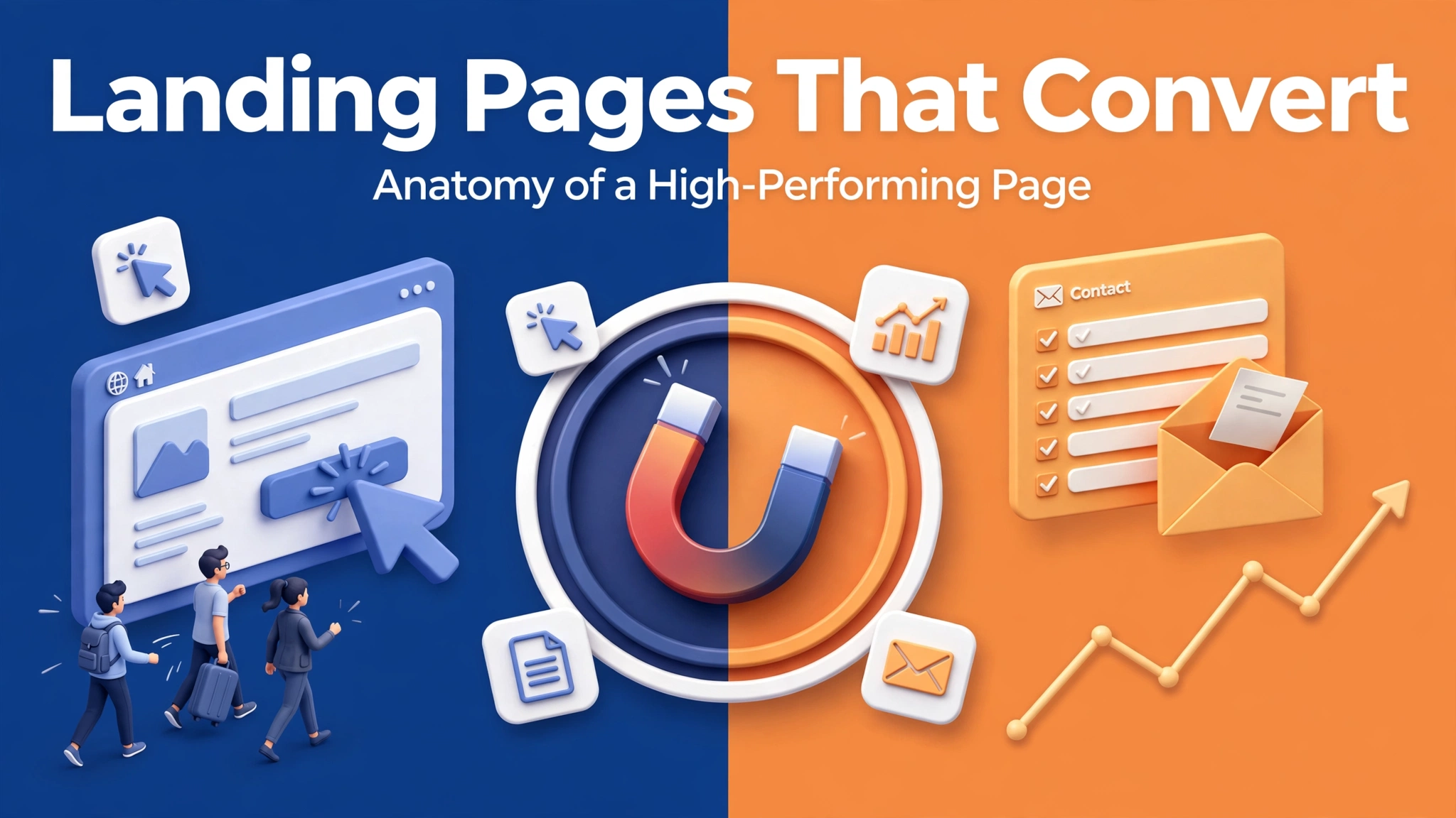
A landing page has one job: turning a visitor into an enquiry, a booking, or a sale. Most business websites fail at this because their pages try to do everything at once. This post breaks down the anatomy of a high-performing landing page, the pieces that move the conversion rate, and what to check before you pay an agency to build one.
A landing page is not your homepage. Your homepage has to welcome everyone and point people in a dozen directions. A landing page does the opposite. One visitor arrives with one question in mind, and the page answers it and asks for one action.
When a visitor clicks an ad for dental implants in Dubai, they should land on a page about dental implants in Dubai, not on a general homepage where they have to hunt for the service. Every extra click before they can enquire is a chance to lose them.
A landing page also has one clear conversion goal: a booking for a clinic, a call for an agency, a purchase or a signup for a shop. The page should be judged on that one number, and nothing else. If a page gets a lot of traffic and almost no enquiries, it is not working, no matter how good it looks.
Visitors decide whether to stay in about five seconds, and the headline does almost all of that deciding. A good headline tells the visitor three things: what you offer, who it is for, and why it is worth their attention.
Compare two headlines for a salon in London. “Welcome to Glow Studio” says nothing. “Hair colour and styling in Central London, booked in 60 seconds” answers all three questions in one line. The visitor knows immediately whether they are in the right place.
The headline should match the ad or link that brought the visitor here. If the ad promises a free consultation, the headline should say free consultation. In our experience, this match is the single biggest quick win on most landing pages. Under the headline, a short supporting line should add the one detail that makes the offer concrete, such as a price range or a guarantee.
The most common mistake on landing pages is clutter. Navigation menus, sidebars, popups, three different calls to action, a newsletter signup, and a chat widget, all competing for the same visitor. Every extra element is an exit door.
A high-performing landing page removes the exits. The navigation is stripped back or removed entirely. There is one call to action, repeated in the same words at the top and the bottom. Everything on the page exists to support that one action, and anything that does not support it is cut.
That does not mean the page has to be short. Long pages can convert very well when the visitor needs reassurance, such as for an expensive service. The rule is not short or long. The rule is that every section earns its place by moving the visitor closer to the action.
Visitors do not trust claims. They trust evidence. A page that says “we are the best” converts worse than a page that shows why.
The strongest proof is specific. A testimonial with a real name and a real result beats a row of five-star icons with no names attached. A before and after photo beats a paragraph about quality. A short client list beats a claim about experience.
If you are a new business without testimonials yet, use what you have: a clear description of your process, a guarantee, a photo of your actual team, or a sample of your work. A page with honest, modest proof converts better than a page with grand claims and nothing to back them up. Our guide to website redesign signs covers the wider problem of a site that no longer earns trust.
The form is the moment of truth, and it is where most landing pages quietly fail. A visitor who has decided to enquire will still walk away if the form asks too much.
The rule is simple. Ask only for what you need to start the conversation: name, contact details, and one useful question. Every extra field costs you enquiries. Asking for a budget range and a full project brief on a first contact form is asking a stranger to do homework before you have earned their trust.
Make the submit button say what happens next: “Book my free call” tells the visitor what they get, while “Submit” tells them nothing. After the form is sent, show a clear confirmation, such as “Thanks, we will call you within one working day.”
Mobile matters here more than anywhere. Most landing page traffic now arrives on a phone, and a form that is hard to tap or slow to load will lose those visitors first. Test every form on a real phone before the page goes live.
A landing page that loads slowly never gets the chance to convert. Visitors leave before the headline appears, and the bounce rate looks like a copy problem when it is actually a speed problem.
Three things decide this. First, the page should load in under three seconds on a normal mobile connection, which means images sized properly and no heavy video autoplaying. Second, the layout must work on a phone without pinching or sideways scrolling. Third, the call to action must be reachable without scrolling on a phone, so the visitor can act the moment they decide.
Our comparison of Webflow versus custom development explains the trade-offs in how a fast, modern page gets built, and the right choice depends on your budget and how often the page will change.
A landing page without measurement is a guess. You need two numbers: the conversion rate, out of every hundred visitors how many take the action, and the source of the traffic, so you know which ad, email, or search brought the visitors who actually convert.
Set up tracking before the page goes live, not after. Check the numbers weekly, not daily, because daily numbers jump around and tempt you into changing things too fast. When you change something, change one thing at a time, so you know what caused the change.
A realistic expectation helps. A good landing page often converts somewhere between a small single digit percentage and the low teens, depending on the traffic source and the price of the offer. If a page converts at near zero, the problem is usually the message match or the form.
If you hire an agency, these are the questions that show whether they understand conversion or just design. Ask what the conversion goal is, and how they will measure it. Ask how the page will match the ad that sends traffic to it. Ask what proof they will use, and whether they will help you gather testimonials. Ask how many fields the form will have, and why each one is needed. Ask how fast the page will load on a phone.
Ask what happens after launch. A landing page is not a one-off deliverable. The first version is a starting point, and the numbers from real visitors tell you what to improve. An agency that hands over a page and disappears has sold you a poster. One that watches the numbers and improves the page has sold you a sales tool.
Finally, ask to see a page they built before and the result it got. Real numbers from a real page are worth more than any portfolio screenshot.
It depends on the decision. A free signup can be short. An expensive service needs more room for proof and answers. Every section should earn its place by moving the visitor toward the one action.
Yes, when the ads promise different things. Each landing page should match the message that earned the click.
As few as possible: name, contact details, and one useful question. Each extra field reduces the number of people who finish the form.
Track the conversion rate and the traffic source. A healthy page converts a small single digit percentage of visitors or more, and the rate should improve as you test one change at a time.
A landing page is not decoration. It is the page where your marketing money turns into enquiries, or disappears. If your ads bring clicks but your pages bring silence, the page is the first place to look.
Book a free strategy call and we will review one of your landing pages with you and show you where visitors are dropping off. We reply within 24 hours.
More from the studio.
Flutter Web in 2026: is it ready for production? Performance, SEO, and the cases where it wins or loses, explained for founders.
Talha Javed7 min readWebflow vs custom website development compared honestly: cost, flexibility, SEO, ownership, and when each wins, so you pick the right build for your business.
Talha Javed7 min readSeven website redesign signs your business has outgrown its site: slow pages, lost enquiries, and content you can no longer update, plus what to fix first.
Talha Javed7 min readA free 30-minute call with a senior engineer. You leave with a plan and a price range, whether or not you hire us.